Seattle Kraken
Creative Direction, Branding, Case Study
Client: Seattle Kraken
Role: Sr. Art Director
Seattle—one of the world’s best-known sports cities—and its community of sports fans had been eagerly awaiting a hockey franchise since its previous success in the 1970s. In 2018, much to the delight of Seattleites and hockey fans alike, the NHL officially announced that Seattle would be awarded an expansion team to kick off the 2021-2022 season. Almost immediately, frenzy broke out among fans in bars, subreddits, and everywhere in-between, speculating the team’s name.
I was brought on as one of the lead creatives working outside of the NHL. Working directly with the team’s stakeholders, Adidas, and multiple agencies, we collectively defined the Kraken personality, brand, and experience. Our goal was to announce the name with fully refined activations that weren’t just cool, but innovative and immersive—they needed to appeal to the entire city along with the NHL fan base—a campaign that moved beyond the world of sports itself.
The team went through various checkpoints: renovated Key Arena (now Climate Pledge Arena), Seattle’s hockey history, fan speculations, training facility/experience, predetermined rivalries, in-game experience, merchandising, and partnerships with notable artists, brands, and restaurants within the region.
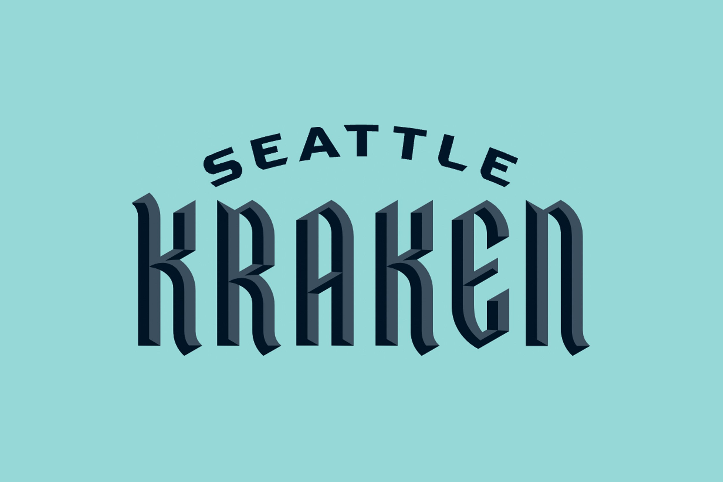
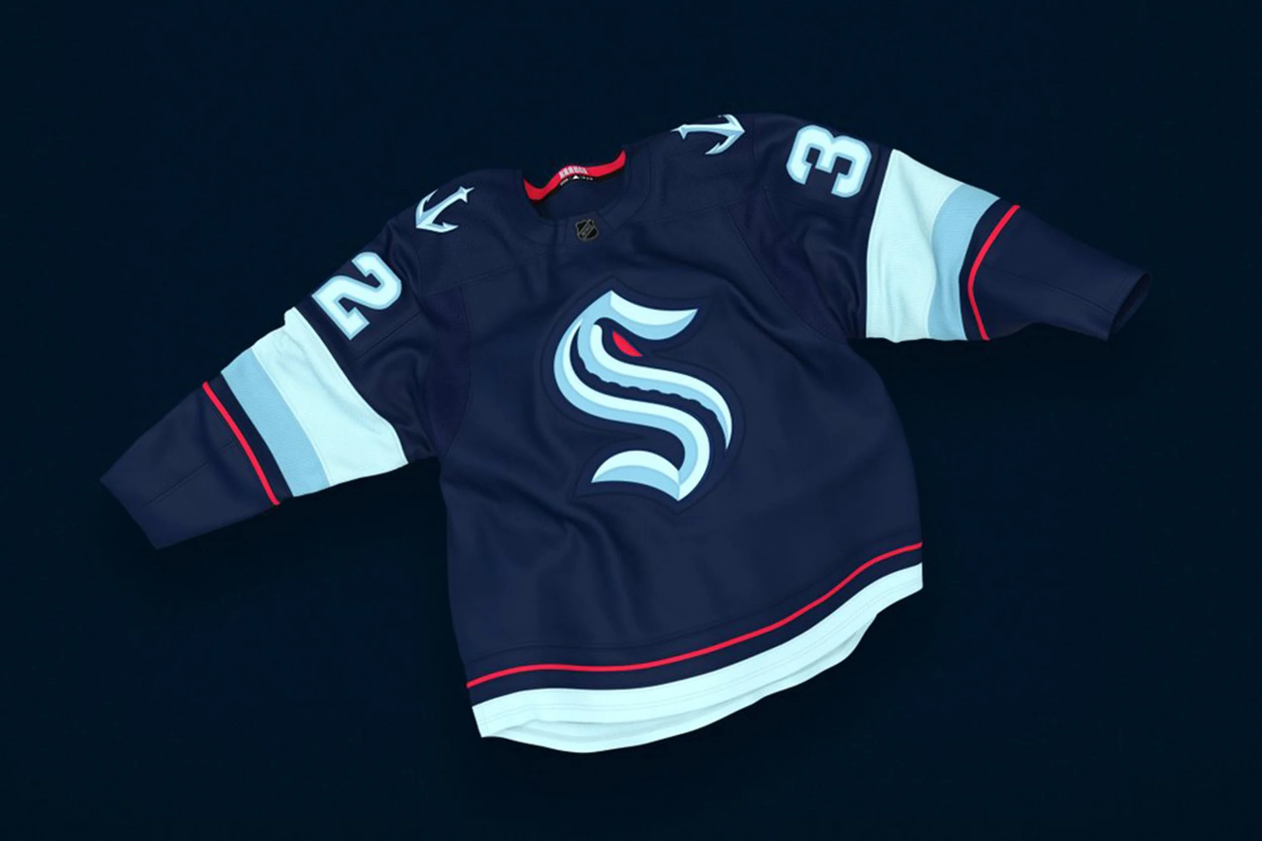
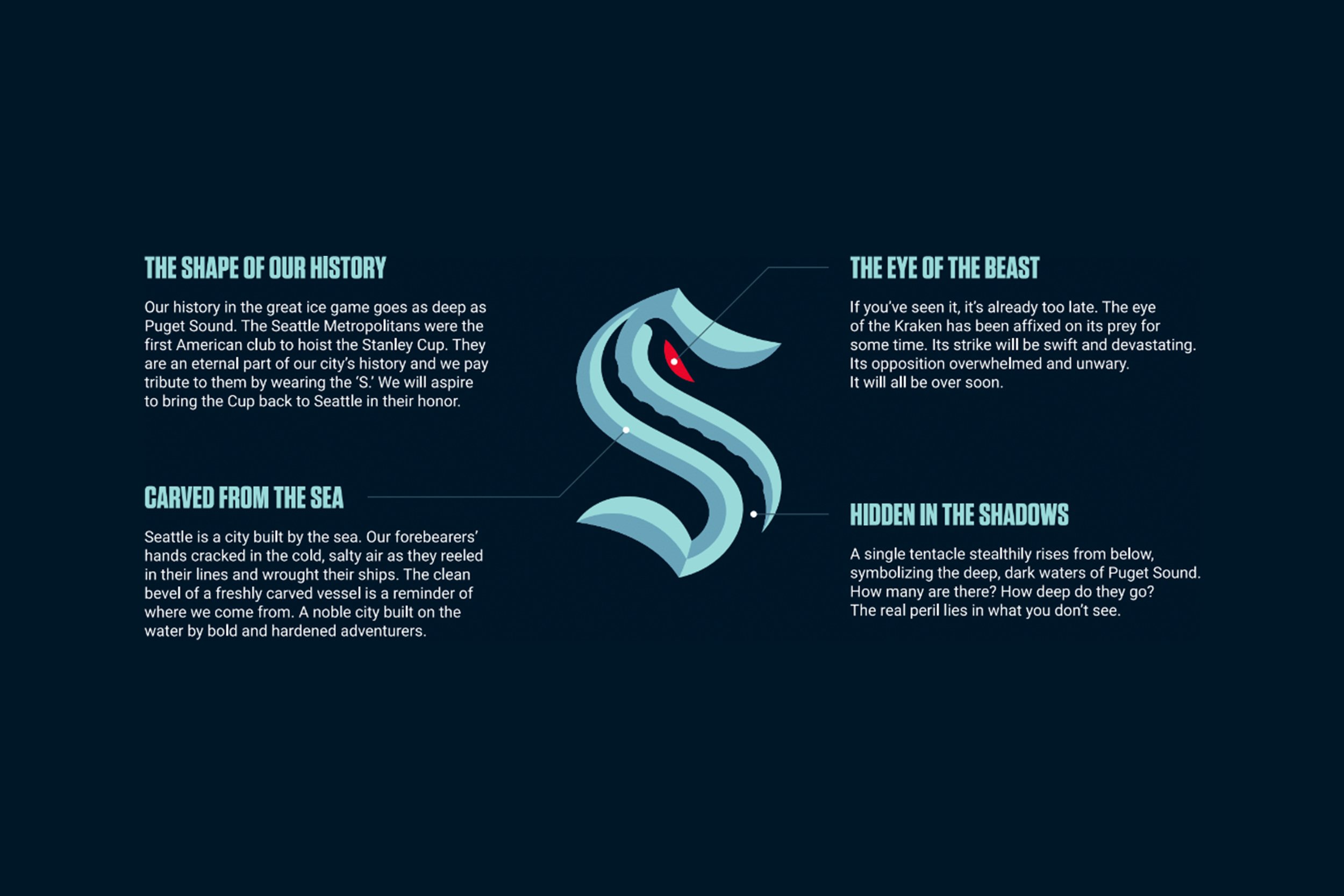
18 months of research and collaboration between leadership, local artists, naming experts, and historians created the brand and rallying cry for Seattle Kraken fans. The “S” symbol is an homage to the city’s hockey history–specifically when the Metropolitans won the Stanley Cup in 1917–with an evolved blue color palette to rival the rest of the league with its untamed ocean hues along with clever use of negative space hinting at creatures beneath the surface ready to attack.
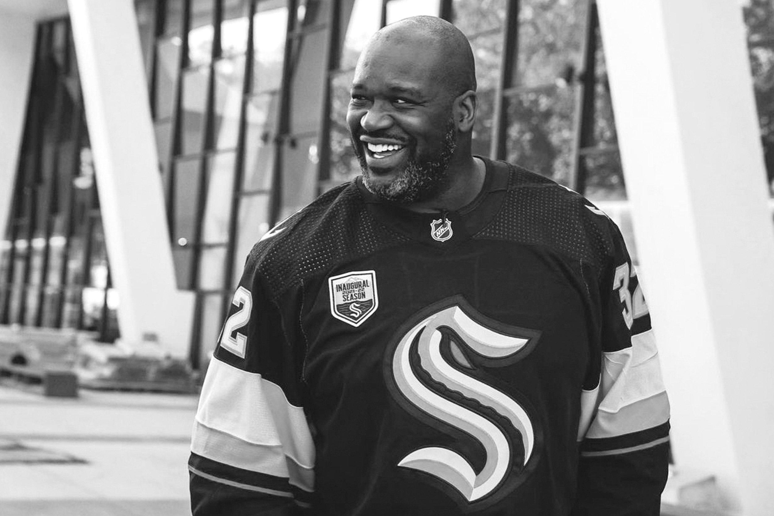
The announcement in July 2020 quickly generated buzz for the enigmatic sea beast and now Seattle has released the Kraken!